Before Other Boys was a script, or even an outline of a script I knew that I wanted the illustrations to be filled with color. For me, color is as important as the drawings themselves, and almost as important as the actual story. I was a little worried about how this choice would be received because many of the graphic memoirs I’ve read have very muted color pallets that match the (often melancholy) tone of these true stories. But I knew I didn’t want that. From the beginning, I had imagined the color scheme and illustrations would juxtapose the story, and helping to soften the sadder sequences.

When I was very young, no matter how dark things seemed in real life, my world was filled with color. I knew from the beginning that I wanted Other Boys to be just as I perceived this world I’d been thrown into. Much of my early childhood took place in the late 90s through the mid-2000s. I spent a lot of my time after school watching cartoons like Hey Arnold! and Recess, as I played with colorful Fisher Price Little People. Between cartoon episodes colorful LEGO commercials flashed on screen, kids exclaimed “Nickelodeon Magazine, please!” accompanied by orange splats, and Barbie bounced her blonde hair and twirled around in hot pink gowns. Grownups might be fighting behind me about one thing or another, but I shielded myself with shapes and colors… with cartoons and toys and games. Across almost everything I saw around this time was a use of primary colors (mainly red, yellow and blue, as pictured below). This seemed particularly prominent from 1996-2002.

These are some of the things, and their bright primary colors made me happy when I was small, even when it felt like my family was crumbling apart around me. I have these distinct memories of my grandmother bringing me to an educational toy store at the mall called Noodle Kidoodle, where I’d admire the Playmobil dollhouses, read Arthur books next to giant Madeline dolls, and maybe pick up a LEGO set on the way out. It was also the place where I could play games like Pajama Sam on their colorful computers, and I loved the bright colorful carpets that coated the whole store, much like an arcade or movie theater at the time. Afterwards, my grandfather might take us to the McDonalds Play Place and we could play with the Nintendo 64 setup they had, and leave with a tiny Beanie Baby.

As I reached middle school I became almost afraid of color. Colors had meanings, which lead to reactions, which lead to judgements. Early on in Other Boys I briefly touch on this when a boy in my first grade classroom is judged for wearing purple, which is seen as a “girly” color.
As I got older… brighter colors disappeared from my wardrobe, replaced with dark blues, greens and grays. Gender roles and expectations played a huge part in that for me, since I was teased for wearing purple or yellow or even having red shoes. These things seem so arbitrary looking back, but when you’re young and spending every day with the kids that say these things you take them to heart. “You don’t want to be seen as a target” is what my grandmother would say, and while she was protecting me, it almost felt like she was also picking on me. As I looked around, I noticed a lack of color was pretty common in adults as they got older. At times it felt a little bit like all of the grownups I saw had all of their colors leached out of them completely.
Eventually my pink, yellow, red and lime green school notebooks for my 6th grade classes became dark blue, medium blue, grey and black for the start of 7th grade. Despite wanting a pink zip-up binder like the one on the cover of Other Boys I only had one in dark olive green that I would scribble all over with pen.

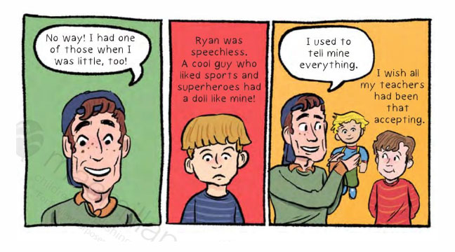
“Other Boys” page 36
In Other Boys you might notice that by the 7th grade segments, much of the primary color scheme is completely gone. Replaced with beige, muted green and a musty orange (which was the actual color of my middle school lockers!) As I got older it really seemed like the colors around me were being taken away. The colorful fingerprint paintings, blocky alphabet letters and bulletin boards filled with kid-made artwork of elementary school were replaced with plain whiteboards, drab looking old maps, and gray pictures of old men from history books by middle school. Like the scene in Matilda where Miss Honey has the kids hide all of their artwork before the Trunchbull comes.
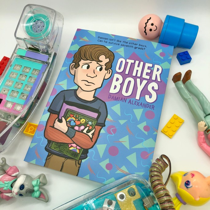
Early in the process of working on the cover of Other Boys with designer Molly Johanson I knew that I wanted it to use pinks, blues, and purples. As a child, I was drawn to these pastel color schemes that appeared in so many of the toys I admired from afar. Pastels were very prevalent on “girls” toys in the early 90s when I was a baby. The softness appealed to me, but grownups had already imprinted the idea in my brain that these were not for me. Because I was a boy. For many boys this sends a subtle message that “girls’ things are bad and therefore girls are bad.” I experienced the opposite, believing I wasn’t good enough for such things.

Eventually, while designing the cover, we landed on a pink version. While I loved the color…it occurred to me at some point that little me would have been too afraid to pick the book up. It was so ingrained in me to not pick up a book with pink or purple as a child because I might get teased. I was too afraid to even read an American Girl book because it had the word “girl” on it. And I have a distinct memory of being teased for reading The Doll People because of the word “doll” on it, and hid it away in my backpack to read at home like it was a dirty secret. While changing the color of the cover might seem like playing into gender rules, it’s more about making sure this book is able to end up in the hands of a kid that might be comforted by it.

The color of the cover became a soft blue, and a few months after the design was decided on as the final cover… I realized how similar it was to a button I had been hanging onto for years. My grandmother had given it to me around middle school when she was clearing out some drawers. It’s from a domestic violence march that my family had gone to in the early 90s in honor of my mother.
To me, these soft pastels and shapes will always feel very early 90s, and while the majority of my life was in the 00s, these colors remind me of my mother. The funky vintage Taco Bell designs, that iconic 90s cup (pictured above), the pastels of “girls” toys of the time. For me, they always come back to my mother. It’s interesting how colors have meanings, and bring memories, nostalgia and all sorts of feelings along with them.

For more information about “Other Boys” check out this link.
Discover more from Damian Alexander
Subscribe to get the latest posts sent to your email.


Thank you so much for this message! I’m so glad you and your kiddo enjoyed the book :) This message means so much
I bought your book while my 13 yr old kiddo, also in 7th grade, was in the hospital. They were thinking about things like gender, the perfect name, and how being bullied for being a bit different has impacted them. Within the first few days of being home, they read this book cover to cover and now want to give it to a few friends at school who can also relate. Thanks for your courage to write a book that speaks directly to the hearts of so many!